The Indian subcontinent pulses with seasonal colour as summer tree canopies burst with blooms and tropical fruit perfumes the air. This instinctive celebration of colour naturally extends into home spaces.
We confer with leading names in the design industry and visit four projects to understand how the right colours can make an impact and work for all seasons.
Rose Milk House by 85:15, Chennai
The green lime plaster streaks the communal spaces, morphing in texture when daylight interacts with its surface.
| Photo Credit:
85:15
Vaishali Srinivasan’s Rose Milk House gets its name from T. Nagar’s Amudha Dairy, where the team often sought refreshment during the construction of this project in summer. The principal architect at Chennai’s 85:15 studio crafts contextually-rooted spaces with a lived-in appeal.
For this 1,500 sq.ft. project designed for her parents, she wanted something special. “Hailing from Tirunelveli and Pollachi, my parents lived simple lives. After numerous relocations, they longed for a home that echoed their childhood. I drew abundant inspiration from the government quarters from the 90s that we had inhabited,” she explains. The dwelling unfolds as a mosaic of personal details: the French red-hued wardrobe fascia, the linear grain of laminated finishes, printed floral linen from the Cathedral Road store, Kalpa Druma, and a framed pichwai in the living area, serendipitously found at a Co-optex exhibition many moons ago.
In Srinivasan’s design playbook, nature plays the eternal protagonist. “The bold band of green lime plaster has become synonymous with the home. We often find ourselves admiring how it catches daylight and reveals varied textures,” she says.
When asked for a trusted method of weaving colour into homes, Srinivasan leans into nostalgia. “Look for recurring themes in the objects around you. Observe art, textiles, and keepsakes to find a palette that resonates with you. This creates colour-driven spaces that feel unmistakably personal,” she advises.
The Leftovers by MuseLAB, Mumbai

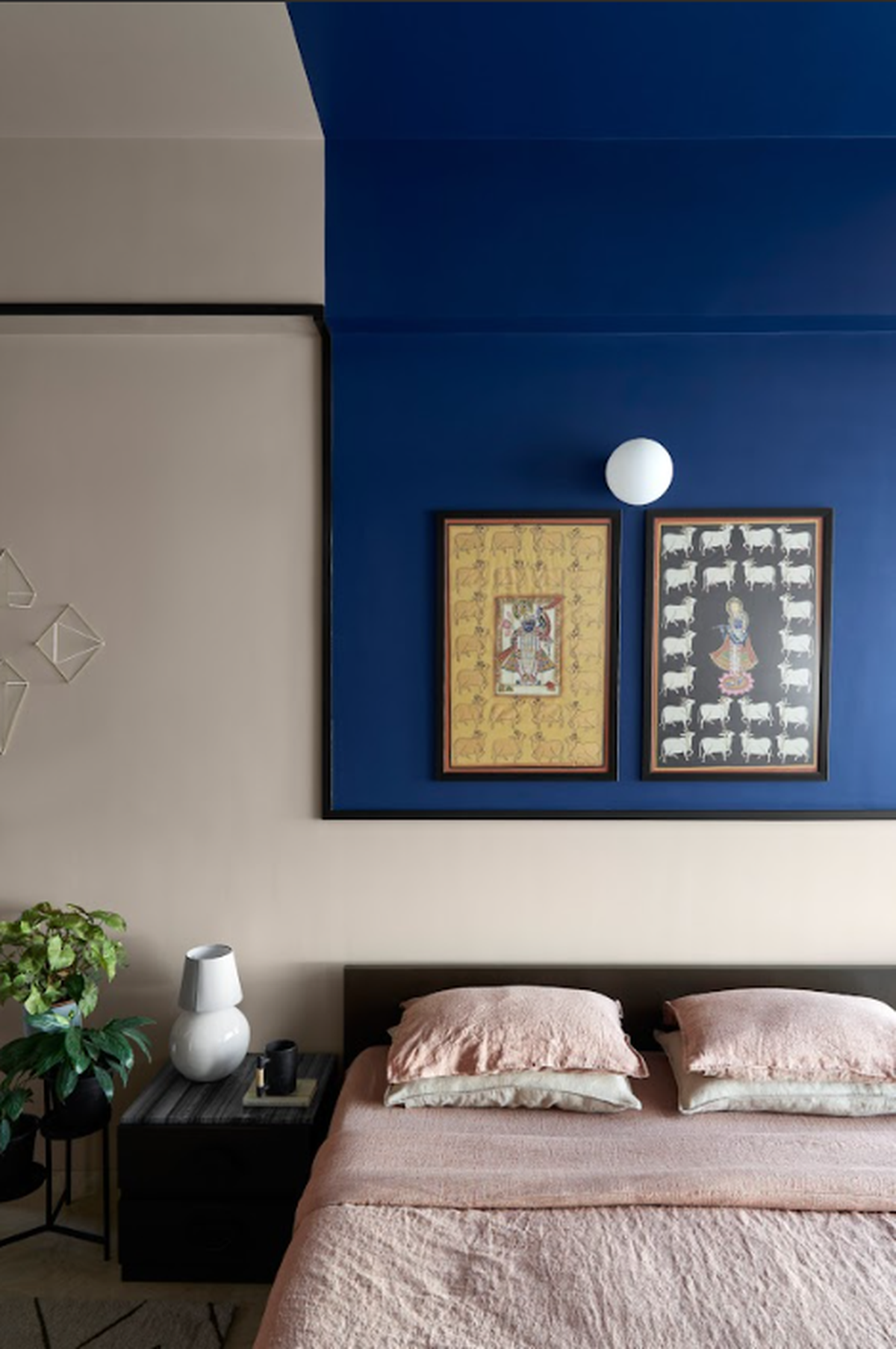
A band of indigo usurps the ceiling and walls, spotlighting the curated art fittingly.
| Photo Credit:
Yadnyesh Josh
For Mumbai-based MuseLAB’s principal architect duo, Huzefa Rangwala and Jasem Pirani, storytelling is an inimitable ally at the drawing board. The Leftovers is a 2,200 sq.ft. apartment in the Maximum City that poses as a neo-vintage gallery-esque home for a family of art and design connoisseurs. This vibrant redesign has transformed the family dwelling, blending colour-blocking with thoughtful curation. A terracotta ceiling diffuses warmth across shared living areas, while each bedroom revolves around a signature hue. Most dramatically, deep indigo cascades from ceiling to wall in one room, creating a fluid backdrop that amplifies the featured Krishna artwork.
“The colours don’t exist in isolation; they dance with the family’s treasured possessions — heirloom furniture, curated art, and quirky finds. In this home, colour isn’t an afterthought. It’s the language through which the family expresses their story and joy,” highlights Rangwala. To introduce colour the MuseLAB way, begin with subtle elements — furnishings, rugs, and layered textiles. Experimenting with tonal variations of a single focal hue creates visual interest. The studio currently favours dusky pinks, powder blues, and olive greens for their sophisticated appeal. “We integrate these shades subtly and boldly, valuing their aesthetic qualities and adaptability rather than adhering to fleeting trends,” notes Pirani.
The Deco Haus by Chestnut Storeys, Chennai

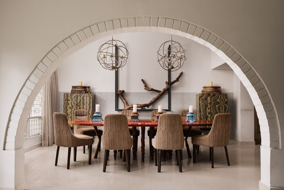
The striking introduction of colour through a piece of furniture in a neutral space creates visual drama at The Deco Haus. Styled By: Samir Wadekar
| Photo Credit:
Ishita Sitwala
At Chestnut Storeys, principal designer Farah Agarwal champions spatial storytelling, conjuring avant-garde environments where contemporary design coalesces with visual drama.
Sprawling over 7,000 sq.ft., the Deco Haus is a private residence nestled within Chennai’s coveted Boat Club enclave. The brief focused on preserving the home’s historic integrity while infusing bold design elements with curated art and sculptural additions.
“At the Deco Haus, colour rules by following a simple rule: statement accents are balanced against subdued neutrals,” explains Agarwal, adding, “We began with a neutral base for the shell, then introduced striking pops of colour through furniture and accessories — like a vibrant red dining table, sculptural inserts, or accent walls in deep greens. This creates a visual rhythm and incorporates personal elements, like art and photographs, which add meaning to the colour choices.”
Agarwal embraces jewel tones this year, blending muted pastels with bolder shades. Earthy hues are incorporated — ochre, moss, and terracotta. “Texture rivals colour in impact and works effectively in small, replaceable doses. Woven fabrics, metallic accents, and natural materials create dimension, energising your palette,” she advises, encouraging newcomers to be open to colour experimentation.
Jade by The Arch Studio, Pune

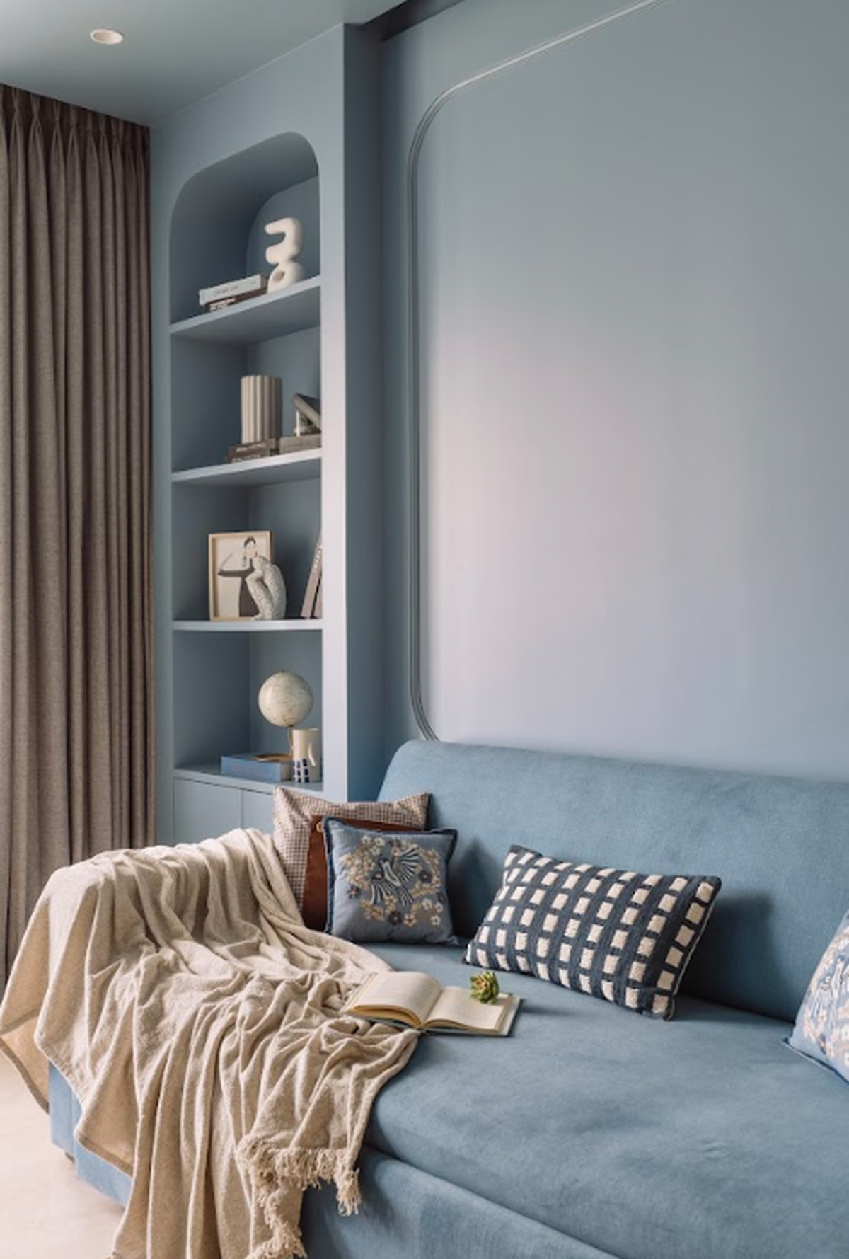
The tonal play of a signature hue at Jade creates visual environments helmed by colour. Styled by: The Soul Concept
| Photo Credit:
Inclined Studio
Warmth, cultural resonance, and functionality are the leitmotifs of principal architect Siddhina Sakla’s endeavours at The Arch Studio, Pune. “In 2025, the studio champions vibrant, soothing tones, like soft yellows and deep greens integrated through paint, fabrics, and finishes, creating emotionally rich spaces,” says Sakla. In Jade, a 1,750 sqft Pune apartment, colour manifests as a visual bookmark, offering an individualistic persona.
Here, hues are entwined to narrate a cohesive story, iterated further through the adept use of textiles, bespoke drapery, Lakkadhaara furniture (a traditional Indian woodworking technique and style of furniture that involves lacquer work), and ornate gold-accented ceilings. Sakla explains, “These balanced additions were crucial in fulfilling the client’s brief. To move away from sterile whites and create a colourful, personalised home reflecting comfort, utility, and nostalgia.”
For Sakla, the interplay of colour and spaces is a carefully choreographed sequence. One can begin by merely choosing a champion hue and building a palette from there, she says. Further, blend subtle patterns and coloured accents via upholstery, vintage finds, or wall mouldings. Layer with curated accessories and rethink essentials like curtains or lighting as opportunities to add colour all year round, she explains.
The writer is an architect and design specialist.
Published – June 07, 2025 08:00 am IST

